1. Bluesky Feeds /
  2. pandemonium.press /
  3. Type & typography

This feed is about type, typography, and letterforms. BlueskyFeedCreator.com

Feed on Bluesky

Feeds Stats

  • 💙 Liked by 0 users
  • 📅 Updated 8 months ago
  • ⚙️ Provider blueskyfeedcreator.com

Type & typography Likes over time

Like count prediction
The feed Type & typography has not gained any likes in the last month.

Feed Preview for Type & typography

Vsigos
@vsigos.bsky.social
8 months ago
Variety is the spice of life. #pixelart #font #typography #pixelfont #rgb
"Variety is the spice of life" with each letter being a different individual design, in rgb colour values on a dark background
0
3
20
John Grindrod
@grindrod.bsky.social
8 months ago
Need a bit of sun in your day? Join comedian Angela Barnes and me for the latest Monstrosities Mon Amour podcast. Experience the strange delights of Brighton Marina and the evocative lure of post-war shop typography @angelabarnes.bsky.social johngrindrod.substack.com….
Monstrosities Mon Amour 4: Brighton Marina

johngrindrod.substack.com

Monstrosities Mon Amour 4: Brighton Marina

John Grindrod meets comedian Angela Barnes and together they explore bonkers seaside monolith Brighton Marina, and the delights of 1960s shop-front signage

3
9
42
Amari_Design👁️‍🗨️
@amari-design.bsky.social
8 months ago
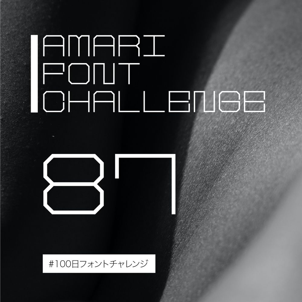
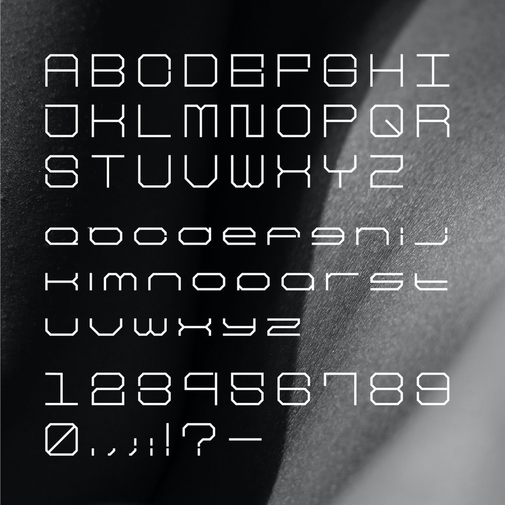
Amari Font 87/100【フリーフォント】 #100日フォントチャレンジ #100DayFontChallenge 枠組みの構造感、丸角を排除、圧迫感を感じる、整然とした印象を与える等幅フォントです。 個人、商用可。 Monospace font has a strong framework structure, gives an unclutteredimpression. ▼FONT DL amaridesign.booth.pm/item… #freefont #font #typography #フリーフォント #フォント #無料配布 #無料
0
0
4
Marceline
@marseline.bsky.social
8 months ago
#GraphicallyYours 28 Thank You @tansleyjames.bsky.social 🙏 The Cure ~ Songs of a Lost World The beautiful sculpture by Janez Pirnat on a black background, paired with elegant typography, will undoubtedly always be linked to the happy memory of the anticipation and discovery of a long-awaited album
The Cure ~ Songs of a Lost World
2
0
26
@fontfreedownload.bsky.social
8 months ago
0
0
2
Aaron Jacobs
@ajacobs.bsky.social
8 months ago
Just spent almost two hours of my limited time on this rock hunting and pecking through a CSS sheet, ready to rip my hair out, because someone named a font sailec_bold in the typography overrides and sailec-bold everywhere else, including the front-facing GUI where all the headers were defined.
King Robert Baratheon wounded in bed, captioned "Give me something for the pain and let me die."
1
0
2
grandpa
@coelesti.bsky.social
8 months ago
true dat lol... hopefully the book is better than this typography snafu haha
1
0
1
Block Bakery
@blockbakery.bsky.social
8 months ago
Primordial Type - Numeric (& Alpha) by @kellymilligan.bsky.social have been added to Gallery B. See other code-based generative typographic art at Gallery B (link in bio.) Our mission is to showcase compelling digital art & elevate digital art on the @tezos.com blockchain. #newzealandart
0
0
3
Patrick’s Rare Books
@patricksrarebooks.bsky.social
8 months ago
Joe Van de Weghe came to visit Patrick’s Rare Books this morning. He brought some new inventory to show me. What a fun morning. Here we are examining an important typographic error in an exquisitely rare Bible. Joe will have some phenomenal items with him at the New York ABAA fair this year.
0
0
2
Justin King
@justinkingdesigns.bsky.social
8 months ago
Reds! Posting red!!
0
4
24
Ohneisser
@ohneisser.bsky.social
8 months ago
In Kazakh language typography, pay attention to the nuances of script styles and letterforms to ensure cultural sensitivity and authenticity in your design.
0
0
0
Ohneisser
@ohneisser.bsky.social
8 months ago
When designing typography for environmental campaigns like "Protect the Nature, the Storehouse of Health!" by Vladimir Tverdokhlebov, consider using eco-friendly font styles and colors to convey the message effectively
0
0
0
rai 🜲 (she/her)
@bookish-delights.bsky.social
8 months ago
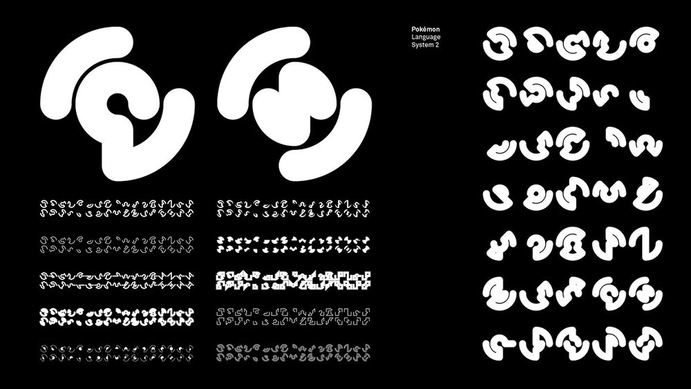
In the film "Pokémon: Detective Pikachu (2019)", the font used for the main titles and end credits combines the Roman alphabet with the style of Japanese characters, utilizing both writing systems to give the appearance of the English language. #Pokémon ⚡️ #Linguistics 🗣 #Typography ✒️ #LangSky 📖
Pokémon Language System 1
Pokémon Language System 2
Title: Pokémon: Detective Pikachu
1
1
6
Keezy Young🌼
@keezyyoung.bsky.social
8 months ago
love that pinterest is like "i see you've looked up "1970s typography."" but remember when you looked up [something completely unrelated] like 2 months ago. what if we seeded your search with that thing too. just in case you wanted to also see [something utterly irrelevant to your current interest]
6
2
160
LADR Landscape Architects
@ladrla.bsky.social
8 months ago
🌎 𝗦𝗺𝗮𝗹𝗹 𝗮𝗰𝘁𝗶𝗼𝗻𝘀 = 𝗕𝗜𝗚 𝗶𝗺𝗽𝗮𝗰𝘁! Being responsible & making informed choices helps protect BC’s ecosystems. From cleaning gear to planting native species & rehoming pets properly, every action matters. 𝗦𝘁𝗼𝗽𝗽𝗶𝗻𝗴 𝘁𝗵𝗲 𝘀𝗽𝗿𝗲𝗮𝗱 𝗼𝗳 𝗶𝗻𝘃𝗮𝘀𝗶𝘃𝗲 𝘀𝗽𝗲𝗰𝗶𝗲𝘀 𝘀𝘁𝗮𝗿𝘁𝘀 𝘄𝗶𝘁𝗵 𝗬𝗢𝗨! #InvSpWk #StopTheSpread
A hand-drawn typography design featuring the phrase "We Are All In This Together" in various shades of green. The text is styled with playful, organic lettering, accented by oak leaves and decorative elements such as lines and splashes, giving it a nature-inspired look. The design conveys a sense of unity, teamwork, and environmental awareness.
0
0
0
Paulo Akira
@pauloakira.bsky.social
8 months ago
Typography nerd here! Where can I find more info on this manner of tracking? I wonder what could be the granularity of such changes. If it is specific enough, a photo of the screen could help identify the leaker if the image is made public. 🤔🧐
1
0
1
Linotype Pilgrim
@symbo1ics.bsky.social
8 months ago
Weird stuff here though. Optima and this Experimental font are relatives, but certainly not similar enough to be called a "remake" or even an accidental copy. The Experimental font has details and intentions in a quite different direction and somebody should definitely pursue it. #typography
Image: A photo of a drawing of "Experimental No. 63" which is an extraordinarly beautiful typeface concept. The words "Districted DID immoderate fgh" have been lettered in ink on paper. Dwiggins' notes, in perfect italic handwriting, read "Modelled san-serif that might be interesting [here he has done a decorative bar linking the two t's in the word and extend its whole length, over the final g] intended to be close-fitted – experimental showing – WAS March 21 1929"

By "close fitted" I think we would interpret this as meaning he had in mind that it would be a Display (headline) typeface. Remembering that he worked at Harper's Bazaar and was no stranger to the world of editorial design, where such a typeface would have found spectacular uses.

Caption: Experimental No. 63, which later found life, under another designer, as Optima. W. A. Dwiggins/Boston Public Library


Article:
This sense of loss is borne out by the fact that in the decades since his death, Dwiggins’ influence has regularly reappeared, sometimes in disguise. In 1952, Hermann Zapf, another famous typeface designer, released his own masterwork, Optima. (You may recognize it from the Vietnam Veterans Memorial, or the end credits of The Exorcist.) Over a decade later, he was shocked to find during an archival trip that he had basically remade Dwiggins’ Experimental No. 63—the so-called “stunt font.”
1
0
1
˗ˏˋ ♡ 𝕸𝖊𝖉𝖚𝖘𝖆 🐍
@nightdescends.posts.love
8 months ago
💯
Typography with white background and black text that says: Next person that play me is getting tazed. Now look at us, both shocked.
2
2
25
Linotype Pilgrim
@symbo1ics.bsky.social
8 months ago
Of course, Goudy is a more obvious Father of American classics but I stand by my Dwiggins cite. A deeply sensitive, unwarrantedly obscure, yet prolific designer www.atlasobscura.com/arti…. #typography
The Lost Typefaces of W.A. Dwiggins

www.atlasobscura.com

The Lost Typefaces of W.A. Dwiggins

The pioneering designer created dozens of fonts, only a few of which are still around today.

3
0
3
Hidden, might be NSFW