
type-atlas.xyz
Typefacts – Typography understandable. Instead of a separate account, this feed catches my #typefacts posts. BlueskyFeedCreator.com
Feed on BlueskyFeeds Stats
- 💙 Liked by 4 users
- 📅 Updated 5 months ago
- ⚙️ Provider blueskyfeedcreator.com
typefacts.com Feed Likes over time
Like count prediction
The feed typefacts.com Feed has not gained any likes in the last month.
Feed Preview for typefacts.com Feed

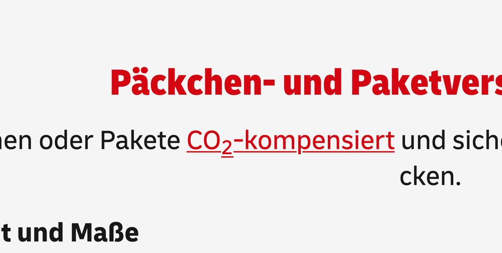
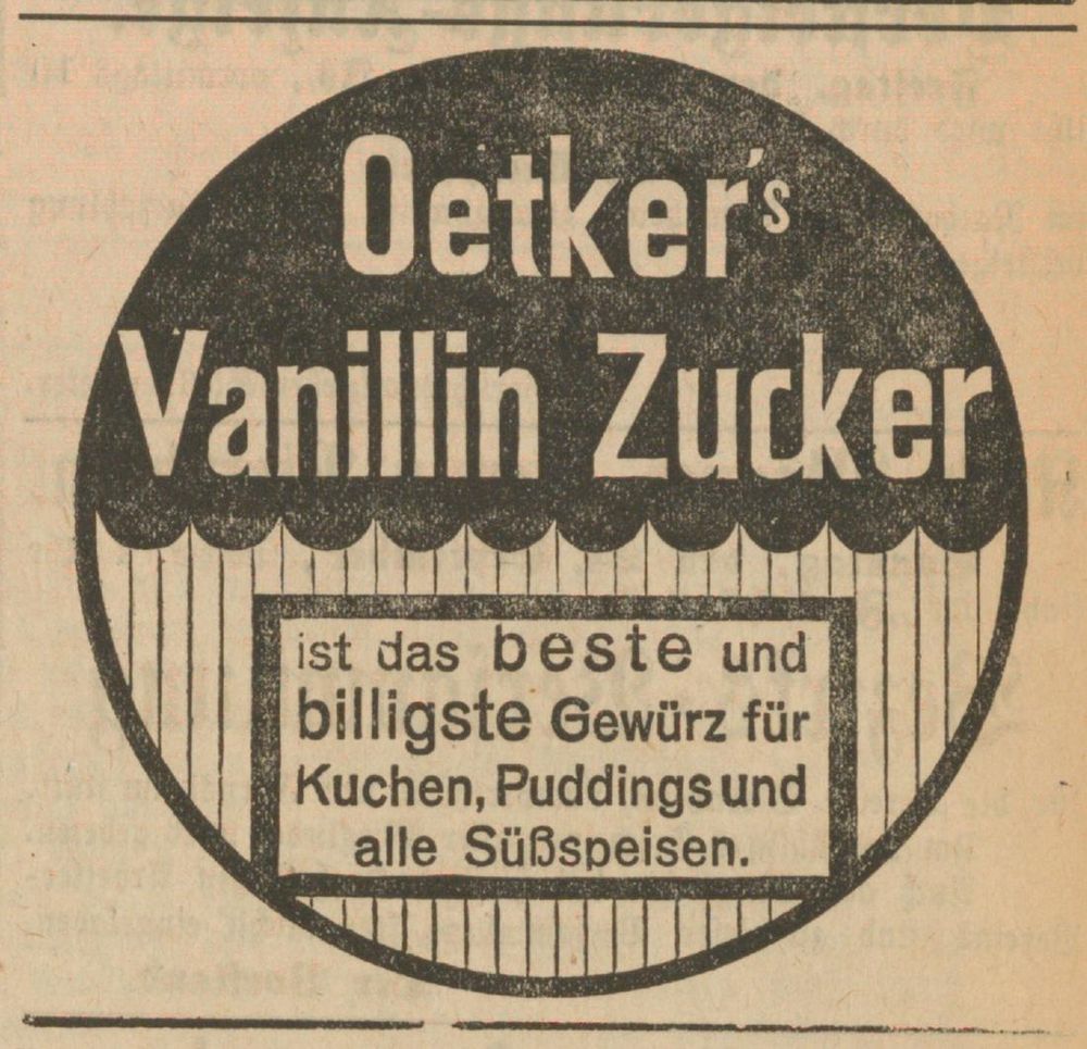
Deshalb lieber den korrekten Unicode »₂« nutzen anstelle einer umformatierten »2«! #typefacts
☞ codepoints.net/U+2082
1
0
3
Amazing concept!
“It can produce thousands of unique variants, each featuring a different combination of characteristics. Once purchased, a particular variant is no longer available to any other customers. It will be yours exclusively! Nine variants are made available every day.”
#typefacts

Rosetta@rosettatype.bsky.social
🚀 NEW WORK: Only Yours gives digital texts a unique look that is *truly* yours. We have created a polyphonic system capable of producing a multitude of individual voices, allowing each customer to pick their own, exclusively. Check out the minisite, it’s kind of cool: ➡️ rosettatype.com/OnlyYours


0
0
6
Dan does all the hard work to keep us updated on new typefaces, foundries, &c; and I can’t thank him enough! 🫶
(This time a special thanks for including @sportsfonts.com!)
#typefacts
Atlas of Type@type-atlas.xyz
For your w/e reading pleasure, a long-overdue edition of #AtlasOfType news feat. the typeface releases, updates and expansions of the past month*, as well as new foundry sites, cool projects to explore, publications to order, fundraisers to fund, deadlines to observe: type-atlas.xyz/news/2025-05...
1
3
8
🆓 Look what a beautiful typeface Benjamin Blaess, Julien Priez & Mathieu Réguer have crafted for Strasbourg! 😍 Words by @typeoff.bsky.social.
azimut.strasbourg.eu/engl… #typefacts
azimut.strasbourg.eu
Azimut
Azimut
0
0
7

(Die weißen Buchstaben mit schwarzer Umrandung offenbaren die Art von Überlappungen, die normalerweise nur zum Interpolieren der Schrift beibehalten werden und in ausgelieferten statischen Fonts entfernt sind.) #typefacts
1
0
2
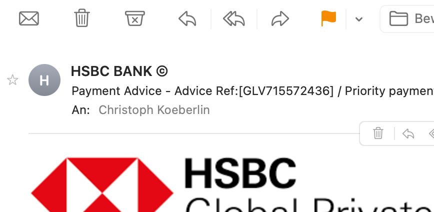
Manchmal ist es vorteilhaft, ein bisschen was von Typografie zu verstehen. Das Copyright-Zeichen (©) steht z.B. nie nach einem Wort, deshalb ist diese Spam-Mail schnell als solche zu erkennen.
☞ typefacts.com/artikel/typo... #typefacts
0
0
4
“After two years collecting data from 171 independent type foundries, we publish the first statistics and resources of Font Licensing Mess. Visit the site for knowing more about it” fontlicensingmess.com — typo.social/@marsidesino #typefacts
fontlicensingmess.com
Font Licensing Mess
0
7
14
#typefacts
( ⬆︎ This hashtag adds the post to my “Typefacts” typography feed. Follow here: bsky.app/profile/did:...)

zeldman@zeldman.bsky.social
As I contemplate a long-overdue redesign, it’s worth looking back at what we’ve learned about web typography over the past 20+ years.
zeldman.com
0
0
2
“Beware the faux bold (and how to fix it)”
clagnut.com/blog/2438/ #typefacts

clagnut.com
Beware the faux bold (and how to fix it)
I don’t know if it’s just me, or if something’s happened in the last few months, but I keep seeing faux bolds everywhere. The fix is tiny and simple, although frankly the mistake is pretty basic – the...
0
0
5

… noch schönere c_h-Ligatur!
#typografie #typefacts
1
0
6
Schöne c_k-Ligatur!
#typografie #typefacts
1
0
4
»Schlaue« Software geht im Deutschen davon aus, dass der »dumme« Apostroph (⇧+#), direkt nach einem Buchstaben gesetzt, als einfaches schließendes Anführungszeichen gedacht ist. Er wird entsprechend in die 6-Form (‘) umgewandelt, obwohl die 9-Form (’) richtig ist.
#typografie #typefacts

Martin Wenzel@supertype.bsky.social
Here in Berlin, 90% of the apostrophes are wrong. I’m afraid it starts to look right to people. (FYI: it should look like the comma aligned to the cap height) What is it like in your country?
0
3
10
Anstatt einen separaten Account zu erstellen, habe ich mich entschlossen, einen Feed für typefacts.com-relevante Posts zu erstellen.
Folgt bsky.app/profile/did:plc:…, für typografische Tips und Zeug!
#typefacts
0
0
2
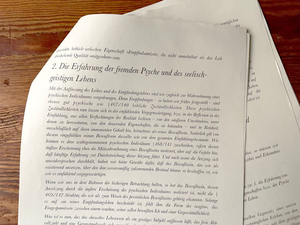
»Die Erkenntnis von Personen« von Edith Stein, ein nicht gerade einfacher Text, komplett gesetzt aus Baskerville Italic — Ist das jetzt typografische Inszenierung oder einfach Schikane‽
#typefacts
1
0
3
Instead of a separate account, I decided to try out a feed for typefacts.com-related posts. Follow bsky.app/profile/did:plc:… for #typography tips & stuff!
#typefacts
1
0
5