
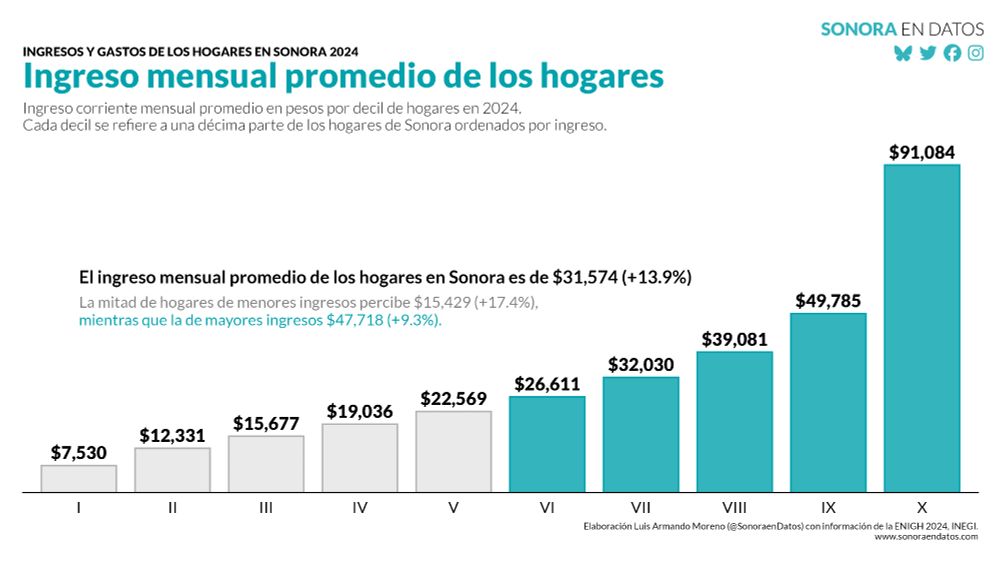
 Cédric Scherer
open.substack.com
Building notes: Sankey diagrams
I don't like Sankey diagrams for visualizing job offers. One woman's attempt to visualize it to her taste and realize her abject failure.
ggplot2 is an awesome! Follow this feed to stay up-to-date on the latest updates and to explore data visualizations created with this versatile graphics library. → mention `ggplot` or `ggplot2` to be featured
Feed on Bluesky


open.substack.com
Building notes: Sankey diagrams
I don't like Sankey diagrams for visualizing job offers. One woman's attempt to visualize it to her taste and realize her abject failure.


github.com
Release RandomWalker 1.0.0 · Issue #235 · spsanderson/RandomWalker
Prepare for release: git pull Check current CRAN check results Polish NEWS urlchecker::url_check() devtools::build_readme() devtools::check(remote = TRUE, manual = TRUE) devtools::check_win_devel()...


serve.podhome.fm
Issue 2025-W31 Highlights
In episode 209 of R Weekly Highlights we learn ways you can pinpoint just what is slowing down your R code, a novel framing for testing your next plumber…


www.youtube.com
Plot Twist: Adding Interactivity to the Elegance of ggplot2 with ggiraph
Description One of the most common critiques of ggplot2 is its lack of built-in interactivity. While static plots are powerful for storytelling, interactive visualizations can enhance exploration,…

www.youtube.com
Plot Twist: Adding Interactivity to the Elegance of ggplot2 with ggiraph
YouTube video by useR! Conference


Bearmathik@bearmathik.bsky.social
Did you know, that brown bears can make entire countries happier? For statistical evidence of that fact, see the animation below #rstats #ggplot #statistics #correlation #causation #Rprogramming #TidyTuesday #DataViz #RStudio (this is of course meant to be humoristic) 🧵


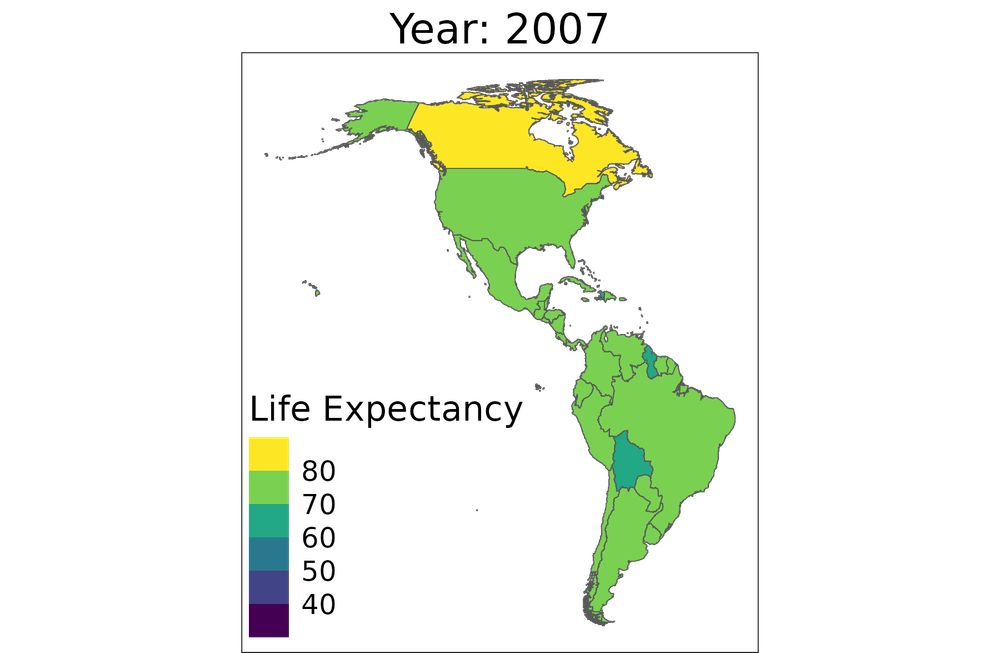
www.jumpingrivers.com
Animated Maps with {ggplot2} and {gganimate}
In this blog we are creating an animated map of the gapminder data using {ggplot2} and {gganimate}. In the process we will cover some of the common pitfalls when working with spatial data and how to get round them!


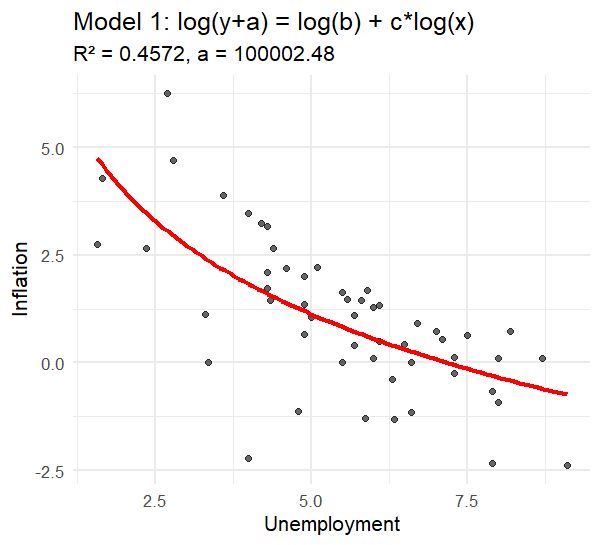
![## model 2 ----
# y = b_0 + b_1*log(x)
mod2 <- lm(inflation ~ log(unemployment), data = df)
mod2_r2 <- summary(mod2)$r.squared
mod2_pred <- predict(mod2, newdata = data.frame(unemployment = unemployment_seq))
p2 <- ggplot(df, aes(x = unemployment, y = inflation)) +
geom_point(alpha = 0.6) +
geom_line(
data = data.frame(unemployment = unemployment_seq, inflation = mod2_pred),
aes(x = unemployment, y = inflation), color = "blue", size = 1
) +
labs(
title = "Model 2: y = b0 + b1*log(x)",
subtitle = paste0("R² = ", round(mod2_r2, 4)),
x = "Unemployment", y = "Inflation"
) +
theme_minimal()
print(p2)
## check equivalence between models 1 and 2 ----
log_b <- coefficients(mod1)[[1]]
c <- coefficients(mod1)[[2]]
best_a * log(exp(log_b)/best_a)
coefficients(mod2)[[1]]
best_a * c
coefficients(mod2)[[2]]](https://cdn.bsky.app/img/feed_thumbnail/plain/did:plc:aqr5h6q7clmeheft3sknegcl/bafkreifywrsvdrjy6qmfls2rjsceeg2bxrveiqfvl3h2wqatxs6cupkxa4@jpeg)