Ansgar Wolsing


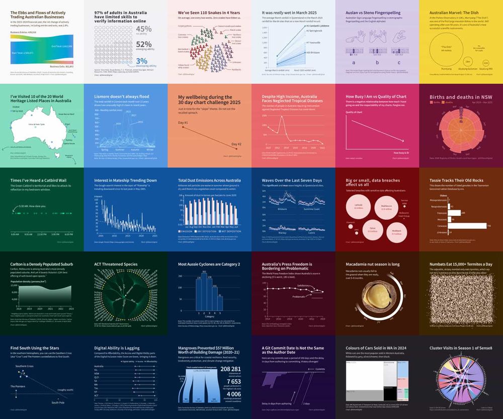
nrennie.rbind.io
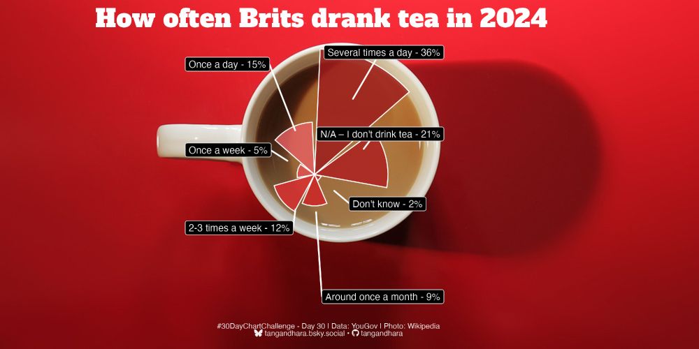
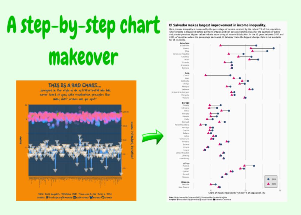
A step-by-step chart makeover | Nicola Rennie
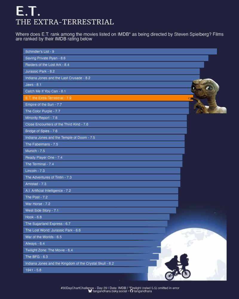
As part of the 30 Day Chart Challenge in April 2025, I made a (deliberately) bad chart, which didn't follow any data visualisation best practices. In this blog post, we'll go step-by-step through the ...